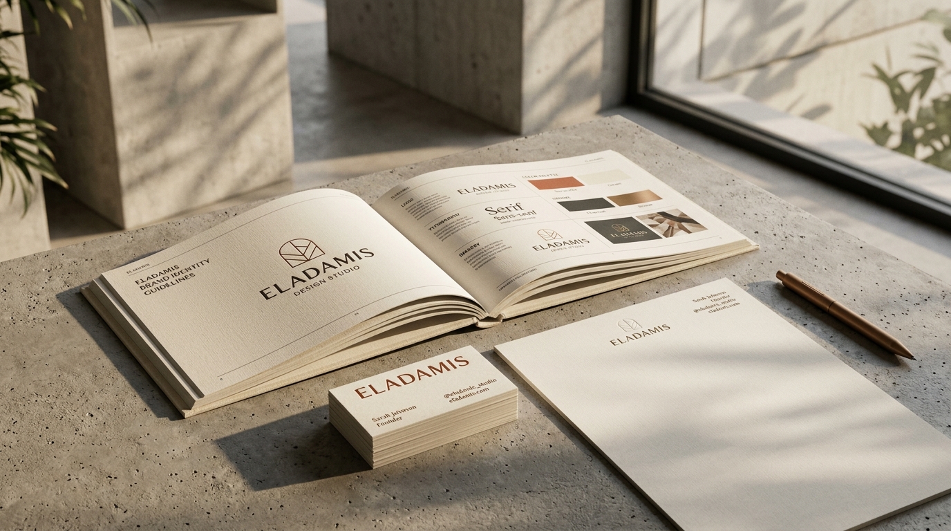
Identity / Studio exploration
Clarity
creates
connection.
creates
connection.
An independent studio concept created to illustrate our approach. It is not a client commission.
The challenge.
Many modern digital brands suffer from fragmented visual communication across proposals, pitch decks, web layouts, and social media avatars, losing enterprise credibility in critical client evaluations.
The direction.
A geometric system turning around one shared centre. Four quarter-circles with stepping radii of 9, 13, 17, and 21. Strictly two graphic devices and zero photography clutter. Confident typography drawn from Syne Bold, Space Grotesk, and IBM Plex.
- Master quadrant geometry (r: 9, 13, 17, 21)
- Space Grotesk & IBM Plex typographic scale
- Brand Guidelines v1.0 Standard specification
- Corporate stationery suite (85x55mm cards, A4 letterhead, 16:9 decks)
Your next chapter
Let’s connect the dots